Ableton Move, or how to excel at design embracing simplicity
I am not a musician.
I can’t play any instrument, I can’t read music, and I can barely sing.
What I am, however, is a music lover. And, as a designer, someone who likes to know how things are made.
That’s why I’ve always had a relationship with music making software and hardware. It started with BASIC and random beeps on my Spectrum 48k, and has continued until today: I’ve played (pun intended) with MOD trackers, sequencers, DAWs, samplers, keyboards, beat-making all-in-one devices…
Obviously, none of them have made me a musician. But, as I mentioned on a previous post, that was never the point. I’ve used these things, enjoyed them, realized I did not have the talent or the patience to become a musician, and moved on.
As part of this never ending journey, I recently got an Ableton Move to replace the emptiness left by my old Akai MPC One, which I sold to someone who was going to make better use of it.
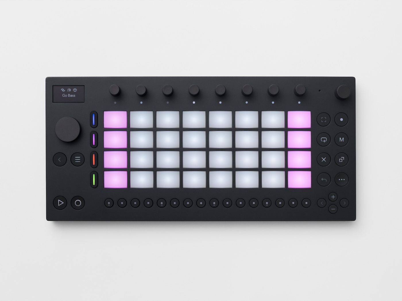
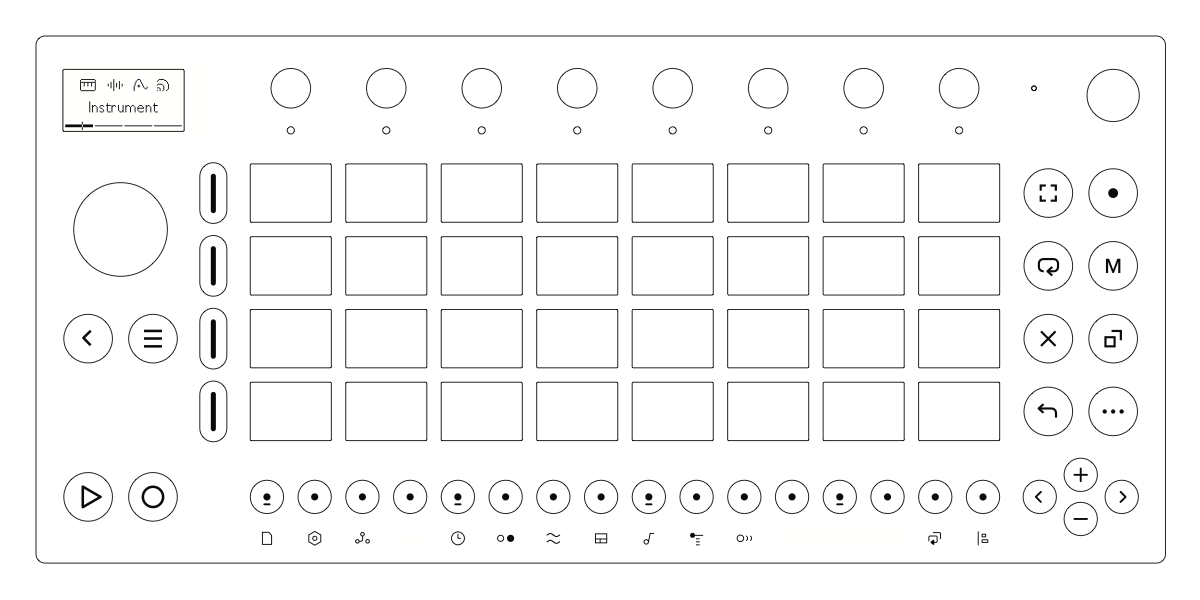
The Move is a small, portable, battery-powered device. It has 32 pads, 10 knobs, and a few buttons. It’s not a full-fledged, all-in-one, music-making machine, but it’s not trying to be one. It’s a simple, focused device that does a few things, and does them well. It only has four tracks, a black and white screen, and as few connectors on the back as possible.
What it also has is a great design.

I mean look at it. I’ve seen Figma files from so-called “designers” that could learn a thing or two from the alignment, spacing, and use of white space on this thing:

And it’s not just the looks. The Move is a joy to use. The pads are responsive, the knobs are smooth, the buttons are clicky. The screen is clear and easy to read. The menus are simple and intuitive…
These are a few things that made me smile while using the Move:
- When you create a new project (they’re called “Sets” in Ableton lingo), you’re greeted with a selection of random presets for the instruments. If you’ve ever used a similar device (or have opened Netflix on a lazy weekend afternoon), you know how much time you can spend just browsing through the available options. This is a great way to get you started quickly, and to inspire you to start playing with the sounds instead of tweaking them.
- The encoders don’t have a label, but are touch-sensitive. This means that you can lightly tap them to see what they do, and the current value, and then turn them to change it.
- The “Capture” feature is glorious. The Move’s workflow encourages you to start playing immediately, so they’ve made it easy to capture your great moments after you’ve played them. This is a great way to capture (see what I did there?) the “wow, I should have recorded that” moments.
- It has a built-in web server. This is a great way to manage complex, non-musical operations, like managing your projects, samples, and presets, update the firmware, or (check this out) export your projects to mp3 to your phone or computer. By moving these operations to a web interface, they’ve kept the device simple and focused on what it does best: making music.
- And, in general, the feeling that things are where you expect them to be, and that they work as you expect them to work. Want to change the volume of the whole project? Move the volume knob. Want to change the volume of a sound? Hold the pad that triggers that sound, and move the volume knob. Want to change the volume of the whole track? Hold the track button, and move the volume knob… It’s simple, it’s intuitive, and it’s consistent.
I’m not saying the Move is perfect. It’s not. It has its quirks, and its limitations. But it’s a great example of how to design a product that is simple, focused, and a joy to use.
It definitely won’t make me a musician. But it’s making me enjoy the time I spend with it, and I think it’s also making me a better designer.