
Drawing with Words
In 2011, I met a great designer, Sebastian Amorim. I learnt many things from him, but he’ll always have a place in my heart for two things: teaching me how to enjoy my food without asking what the hell I was eating, and sharing this quip about HTML I’ve quoted a million times since:
Typing to draw things is the stupidest thing I’ve ever seen.
You can tell he was a fan of direct manipulation (and still is, if you go by the amazing work he does at his workshop).
Even though I don’t entirely agree with him, I keep quoting him because I never let reality get in the way of a good joke.
Yes, drawing with words is a bit silly. But it’s also a lot of fun. And it’s a great way to iterate on your ideas while leaving a trail of breadcrumbs for your future self.
Also (and this is the main point of this post, I think), it’s a great way to document design decisions without having to write and maintain a lot of documentation that will get stale quickly. Some designers get nervous when I say this, but I believe the source of truth should always be the code. It’s the only thing that’s guaranteed to be up-to-date.
The classic “the thing” versus “a picture of the thing” debate.
A quick example
Yesterday, I spent a few hours working on a toggle component, just for fun.
I had the idea while working on an icon for a client project. I looked at it and thought “you’d be a nice handle for a toggle”. I sketched something in Figma to get an idea of what it would look like, and forgot about it.
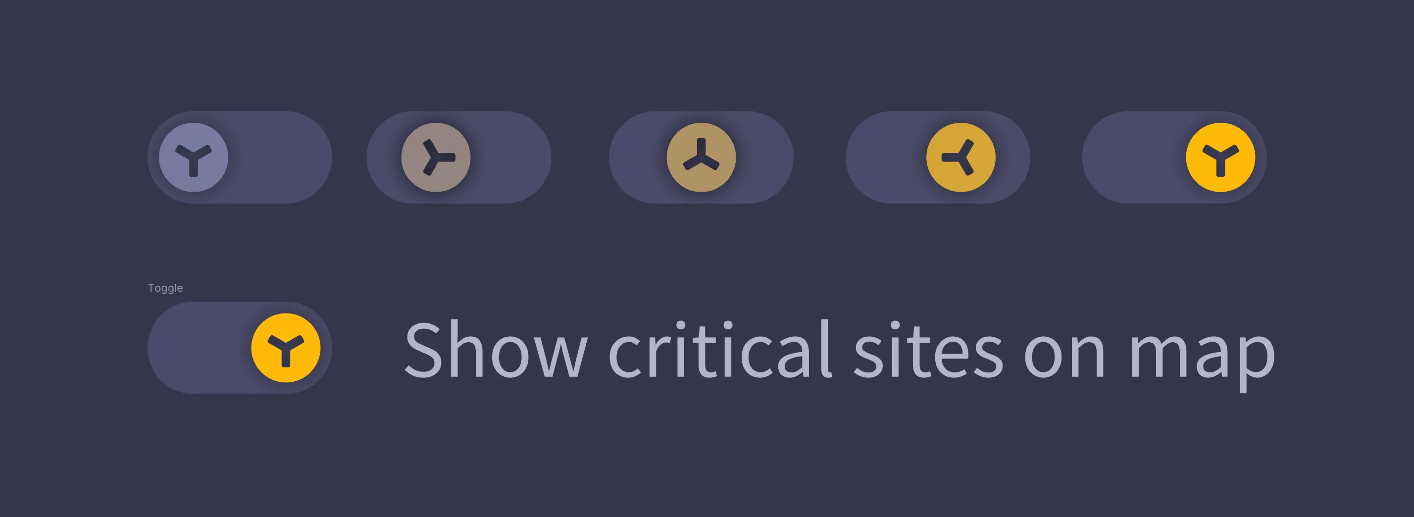
That afternoon, I decided to build the component to refresh my motion.dev skills. I opened my code editor and got to work, until I ended up with this:
There’s a lot going on in this component, so let’s break it down a bit.
The visual design
As you can see, the final component is quite different from the sketch. I decided to add some depth by using shadows and gradients, because I miss 2000’s skeumorphism.
I iterated on the exact tone of the green background a few times, until I found one that I liked. I also tried a few different shades of grey for the off state. As I mentioned on an earlier blog post, I could keep tweaking this forever, but there’s only so much time one can spend on a toggle before going mad.
A very small detail you might not notice is that the spacing between the handle and the background is not the same on all sides. Turns out the spacing looks weird if it’s homogeneous, so I made it 0.5 pixels looser on the horizontal side. You know the old saying: “if it looks right, it is right”.
You can see the trail of breadcrumbs I was talking about earlier if you look at the component’s code:
const handlePosition = isOn ? toggleWidth - size - togglePadding * 2 - 0.5 : 0.5;The motion design
The only reason this whole thing exists is because I wanted to see how the component would feel if the handle rolled while moving. I’m not proud of how much time I spent tweaking the animation until it felt right, but I’m happy with the result.
Turns out it’s not easy to make a handle roll convincingly. I tried a few different approaches, mostly involving the number of rotations and the speed of the animation. Make the animation too fast and you can’t really perceive the rotation. Make it too slow, and you’ll get bored. Eventually, I settled on a 240° rotation and a simple tween animation (with an extra touch of anticipation).
Again: this is the kind of thing that’s hard to document in a way that doesn’t get stale. I could write a paragraph about the animation, but it wouldn’t be as clear as the code itself:
const rotations = 4;
const speed = 0.6;
const handleRotation = isOn ? 60 * rotations : 0;
const transition = {
  duration: speed,
  type: "tween",
  ease: "anticipate"
};
The code
One of the main advantages of drawing with words is that you can create an infinite amount of variations with very little effort, if you plan things right from the start.
In this case, I added a bunch of variables to the component code, and based the visual design on them. This way, I can change the size, the colors, the speed of the animation, and even the number of rotations with a single line of code. This was easy for me, since I’m a firm believer in the rule of “no magic numbers in your code”. Fun fact: there’s an eslint rule for that.
I never write a number in my code, if I can avoid it. I always create a variable and give it a name that makes sense in the context. This way, I can change the value in a single place, and the change will propagate to all the places where the variable is used. For example, my component has a size variable that I can change to make the component bigger or smaller, because everything is based on that variable:
const togglePadding = size / 5;
const toggleWidth = size * 2.5;
const toggleHeight = size + togglePadding * 2;
// Even the size of the shadow is based on the size of the component:
const toggleShadow = isOn ? `inset 0 0 ${size / 6}px rgba(0, 0, 0, 0.4)` : `inset 0 0 ${size}px rgba(0, 0, 0, 0.4)`;
As a nice side effect of that approach, I can expose the size variable as a property, and end up with an infinitely scalable component:
<RoundToggle size={20} />
<RoundToggle size={50} />
<RoundToggle size={100} />
Ok, shut up already
I had a lot of fun building this component, and I hope you enjoyed reading about it. I’m not sure if I’ll ever use it in a real project, but I’m happy to have it in my toolbox.
If you want to play with it, you can find the code here.
Have a great day! 🌈